- Home
- Drawing Tutorials
- Black and White Charcoal Drawing
How to Create a
Blended Black and White
Charcoal Drawing
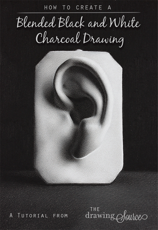
Introducing one of my favorite techniques: the blended black and white charcoal drawing technique!
White drawing pencils (sometimes referred to as 'white charcoal') have a slightly blue color temperature, and when layered over top of regular charcoal, they create a beautiful, silvery surface quality. Check out my page on 3 Ways to Use White Drawing Pencils on Toned Paper for two other methods of using these fabulous drawing tools, and for a side-by-side comparison of a drawing that uses white charcoal vs. one that does not.
As you will see in the Materials List below, I will be drawing on a sheet of homemade toned paper, which you can learn to make here.
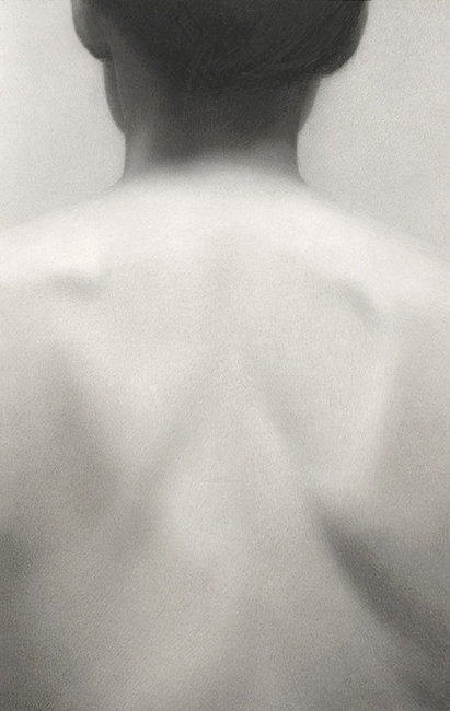 Longer, finished figure drawing using black and white charcoal
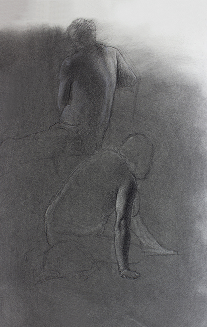 Quick sketch figure drawing using black and white charcoal
I enjoy using this black and white charcoal drawing technique for both longer, finished drawings, such as the one above on the left, and for quicker sketches. Above on the right are a few 15-minute figure studies.
Because the mid-tones are established by
the toned paper, using this method we are free to focus on adding light
and dark values, making this an efficient technique for quicker
drawings.
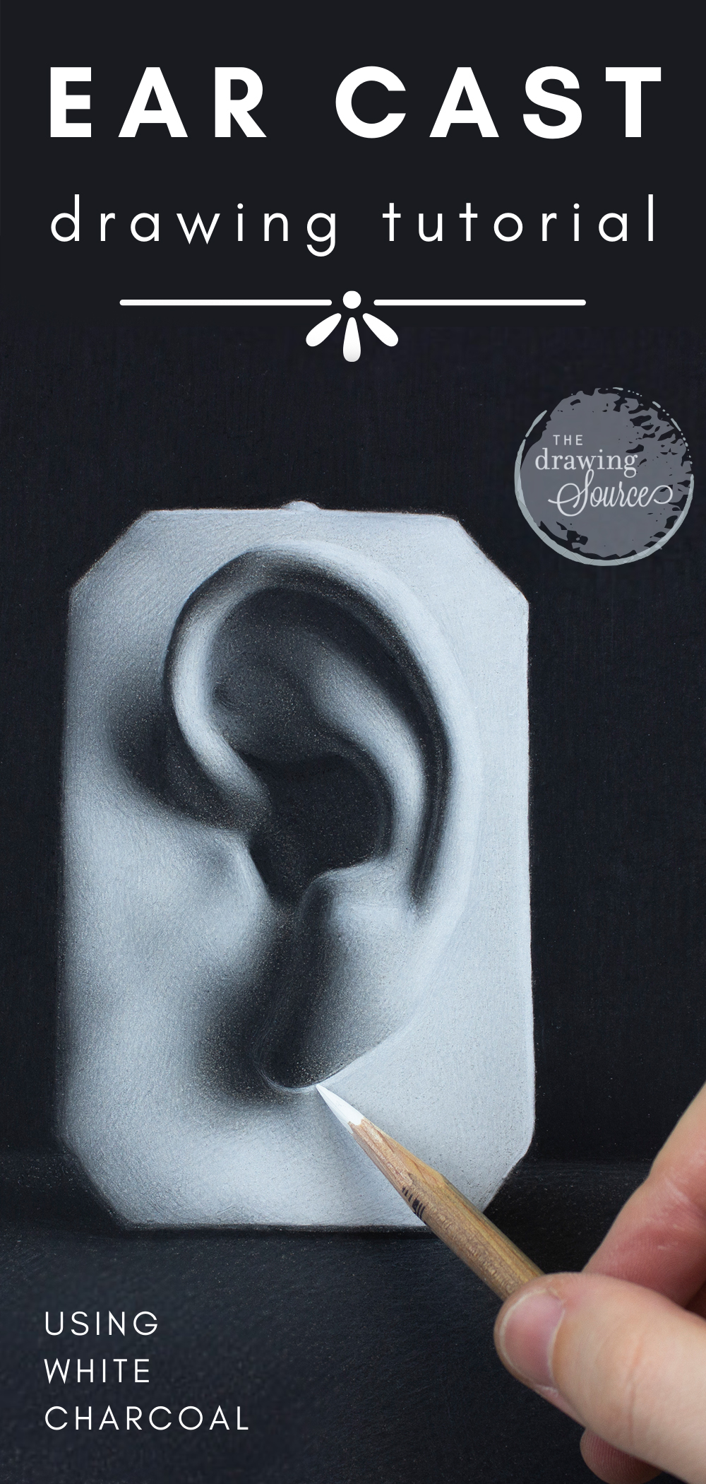
F R E E D O W N L O A D
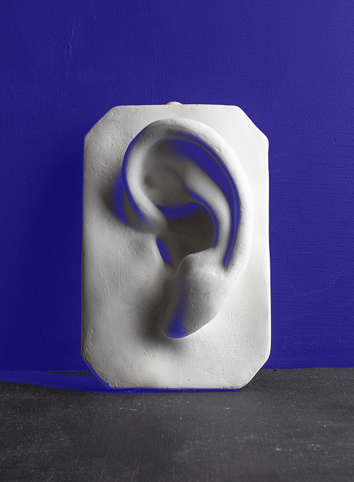
At the end of this article, download a photo reference of the ear cast I'm drawing from, an infographic of this tutorial, and create a black and white charcoal drawing along with me!
Creating a Black and White Charcoal Drawing:
Materials Used in This Tutorial
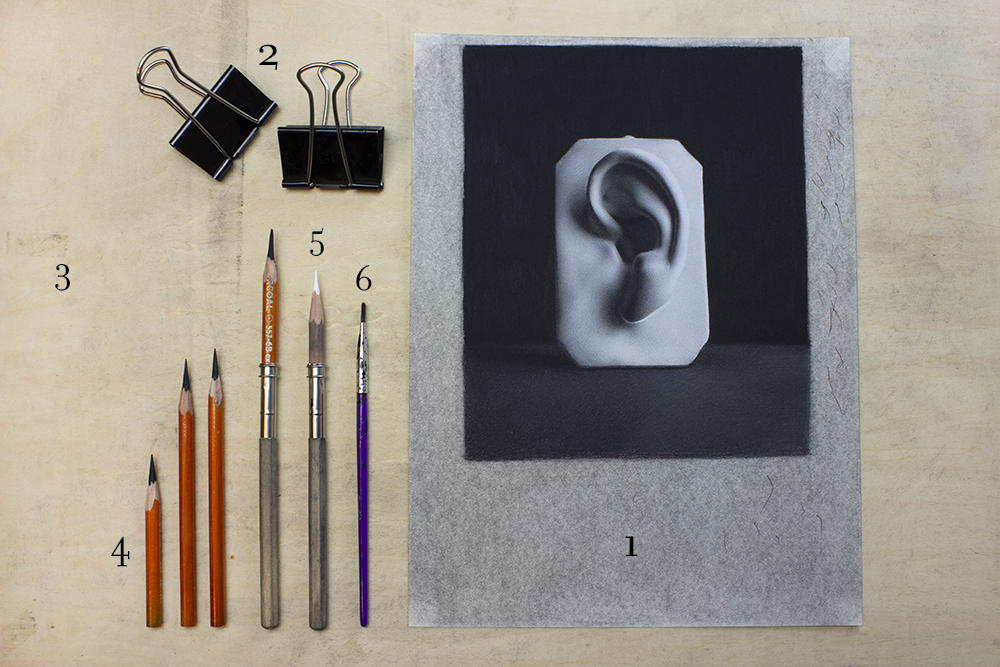
- Homemade Toned Paper: I am using a homemade toned paper in this drawing (I toned a sheet of Strathmore 400 Drawing Paper). Check out this tutorial to learn how to make your own!
- Bulldog Clips: A convenient way to attach a drawing to a drawing board, and preferable to using tape, which often leaves a residue or rips your paper!
- Drawing Board: This is a lightweight drawing board made by Helix.
- General's Charcoal Pencils: HB, 2B, 4B and 6B.
- General's White Charcoal Pencil
- Paintbrush: Inexpensive paintbrushes such as this one are great for blending charcoal.
- Mahl stick: Sorry, forgot to include it in the photo above! As you will see later in the tutorial, a Mahl stick allows me to comfortably reach all areas of my drawing without smudging it. I demonstrate this in my How to Hold and Control Your Drawing Pencil video.
Notice that a common drawing tool is not on this material list ...
There is no kneaded eraser! This 'blended black and white charcoal drawing' technique is quite unique in that it involves no erasing.
Instead, it is an entirely additive process.
Lighter values are added using white charcoal, and darker values are added using
regular charcoal.
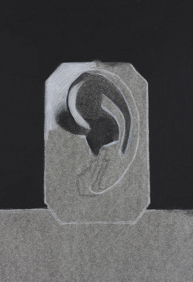
How to Create a Blended Black and White Charcoal Drawing
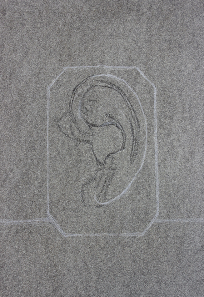
Because this tutorial focuses on the shading stage of drawing, using black and white charcoal, I am going to begin this demonstration with the finished block-in.
I drew my block-in with both black and white charcoal, though this is not a requirement. I chose to do so because the line of the ear on the far right is a very light value, as is the background behind it. I didn't want to draw a dark line that would be difficult to erase there.
Using both types of charcoal in my block-in also happened quite naturally - because this technique doesn't involve any erasing, I corrected some of my dark lines using white charcoal.
Notice that there are variations in line quality throughout my block-in, giving me an idea of where the sharp and soft edges will eventually be located on my drawing.
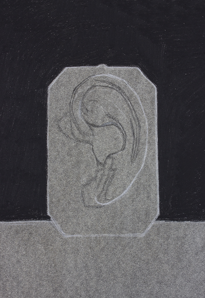
If I know that I am going to add a background to my drawing, I always work 'from back to front', meaning from the background to the foreground, especially if it is one of the darkest values in the scene, as it is here! Why? A value in isolation looks different next to another value. Placing a darker value next to a light value makes the light value look even lighter!
This means that if I wait to add my background until after I draw the ear cast, it's likely that the ear will be far too light, because adding the dark background will only cause it to appear lighter.
Instead, my first goal when beginning to shade is to establish my basic value relationships: where are the dark values, the light values, and the middle values in my scene?
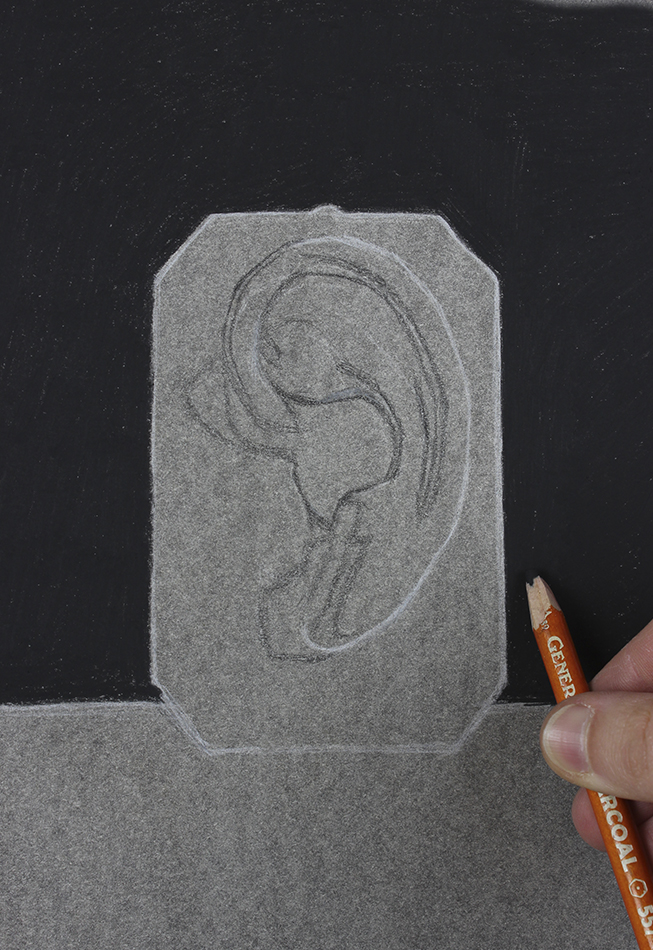
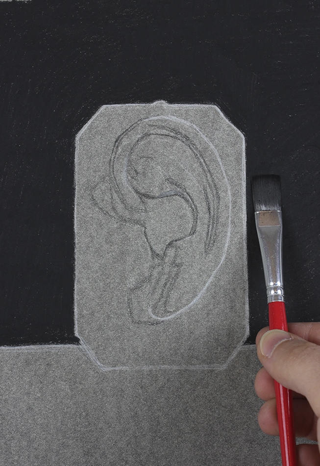
I draw the background in three 'passes' - I use a 6B charcoal pencil to densely draw it first, and then I smooth it out with a paintbrush. Using a paintbrush to smooth out charcoal always lightens its value, so ...

... I then go over the background one more time with my 6B charcoal pencil.
Creating a Black and White Charcoal Drawing:
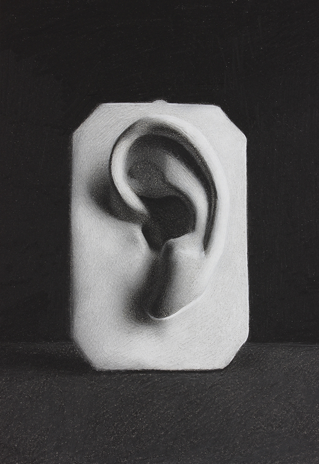
Analyzing the Value Structure of the Subject
Dark Values
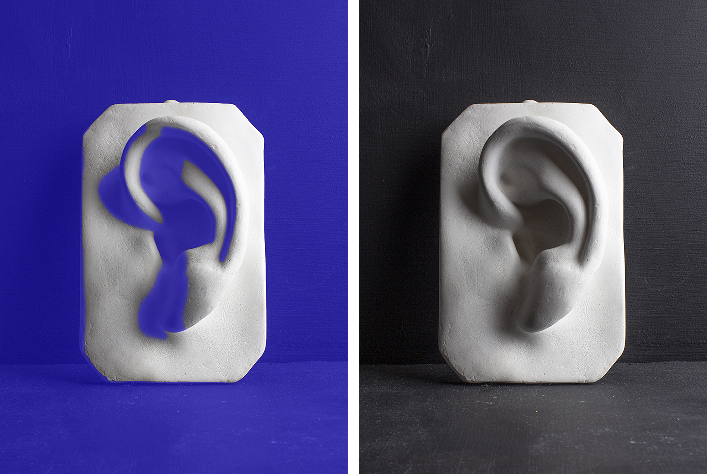
Half-Tone or Middle Values
Light Values
Above is the my first goal: to determine where the light, dark, and middle values are on the subject, and to mass in these three simplified groups of value on my drawing.
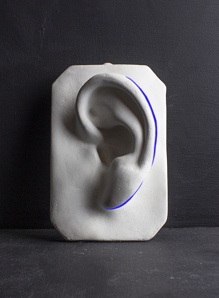
How do I determine what is light, half-tone, or dark? One of the most effective strategies for simplifying values is to squint: literally to half-close your eyes, and notice which areas merge together.
For example, looking at the Half-Tones Diagram above, you may be thinking that there are several values in the area to the left of the ear, some of which might be light values. Sure - with your eyes open, yes. However, squint way down and look again. Notice how light the right half of the plaque that the ear is on appears, and how the half-tones on the left side merge together.
The left side will have to be half-tone so that the right side can perceived as being lighter. Comparison is another effective strategy for determining how light or dark to make a value!
I begin massing in the light and dark values, and will leave the half-tones for later. I'm not worried about smooth rendering at this point, because I will be adjusting the values for some time.
Massing in these light and dark shapes also greatly helps me to judge the accuracy of my proportions. Even though I am working with value, which is often thought of as the stage after the block in, I am still very consciously looking at the proportions of my subject and adjusting them as needed.
Though I am not yet at the stage where I am focusing on the quality of the edges throughout my drawing, I use a paintbrush to create a softer gradation where the softest edges will eventually be.
Note that you can freely layer white charcoal on top of regular charcoal, or vice versa. Working additively (only adding values) instead of subtractively (by taking away value with an eraser) may take some getting used to, but once you do, it may give you a new sense of freedom.
For
some students, correcting a mark by drawing overtop of it rather than
erasing feels less like a mistake, which is excellent, because you
shouldn't be worried about making mistakes! Making a 'mistake' simply
means that you are seeing more sensitively than you were before. That is
what enabled you to notice the difference, and is a positive sign that you
are evolving one of your most important drawing skills: the ability to 'see'.
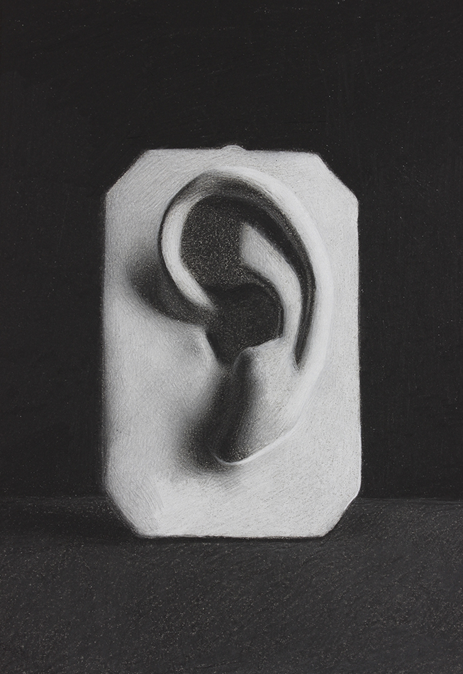
I have my dark and light values mapped out on my drawing, and am feeling much more confident in the overall proportions. Before I can move on to the half-tones in my drawing, I need to mass in the bottom portion of the background.
I draw in the bottom portion of the background in two stages. I begin by drawing in a slightly darker value than the background actually is. This allows me to then layer white charcoal on top, imbuing this area with the blue hue that white charcoal provides. This has the effect of unifying the image.
Don't forget to include the shadow cast by the ear onto the surface that it rests on, which is one of the darkest values in the scene, similar in value to the top portion of the background.
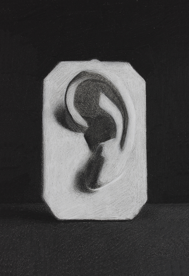
I now have a solid foundation for my drawing. I have established the large and small proportions, the light and shadow shapes, and I have started pulling out a few dark accents, though mostly to check my proportions in the shadow areas.
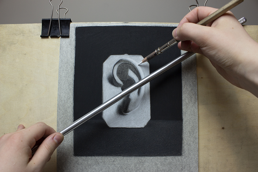
Before we move on to the next step, I want to give you an idea of my drawing setup. It's nothing fancy - my drawing is comfortably attached to my drawing board with bulldog clips (very convenient for taking off my drawing repeatedly to take progress photos).
When you compare the edges of my toned paper to the drawn areas where I have used white charcoal, you can see how much cooler and bluer the areas with white charcoal are.
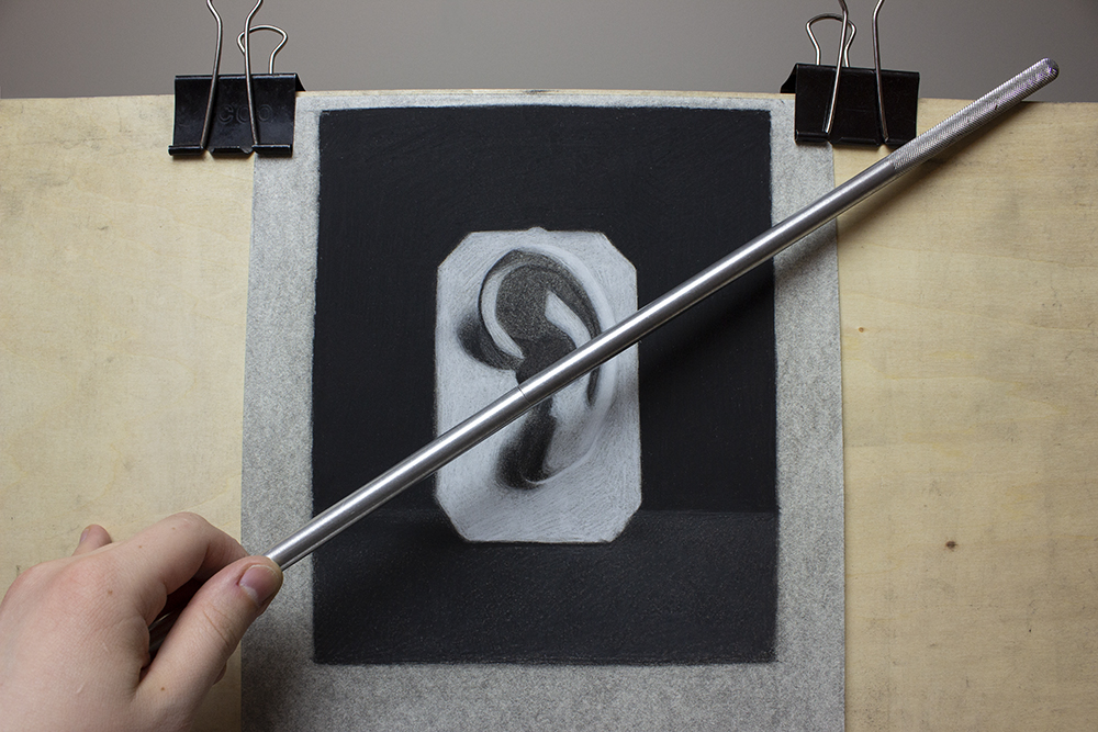
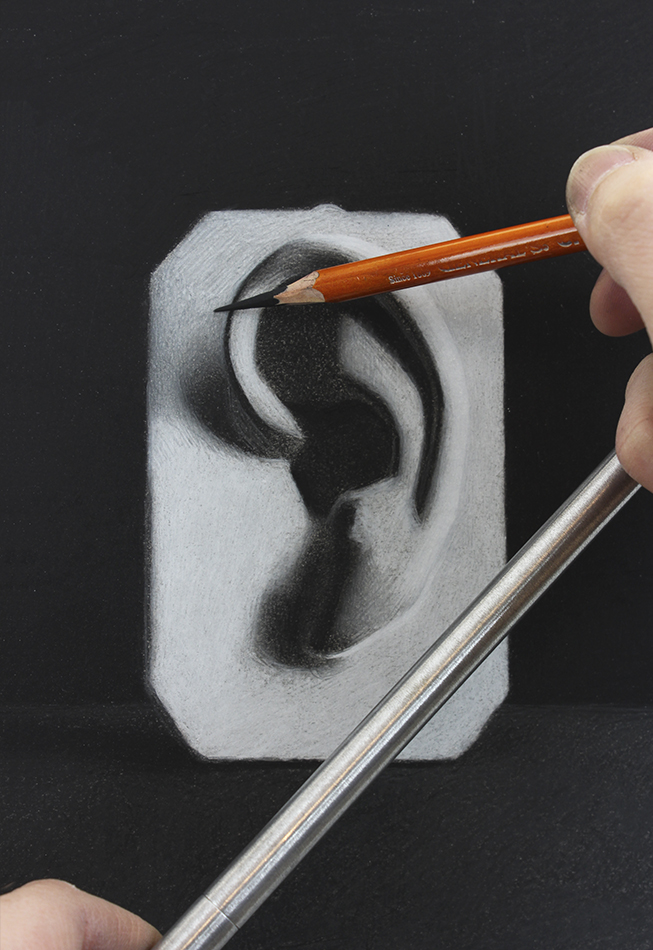
Note: An important point is that I am using a Mahl stick to keep my hand from resting on my drawing. I am right handed, so I hold the Mahl stick with my left hand, and rest it against the top of my drawing board on the right. Watch my video on how to hold and control a drawing pencil for an example of this.
My drawing hand can then rest on the Mahl stick, giving it stability and allowing me to reach all areas of my drawing comfortably, without smudging it.
If you don't have a Mahl stick, a sturdy ruler or curtain rod will work just as well!
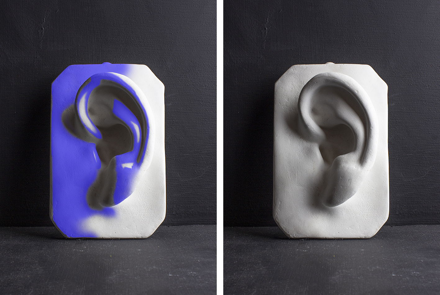
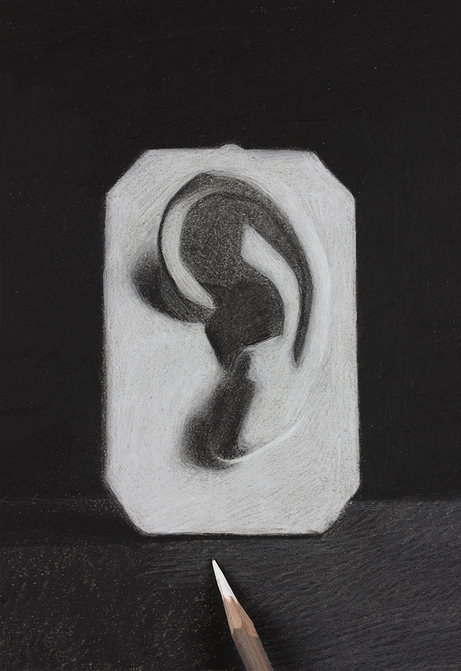
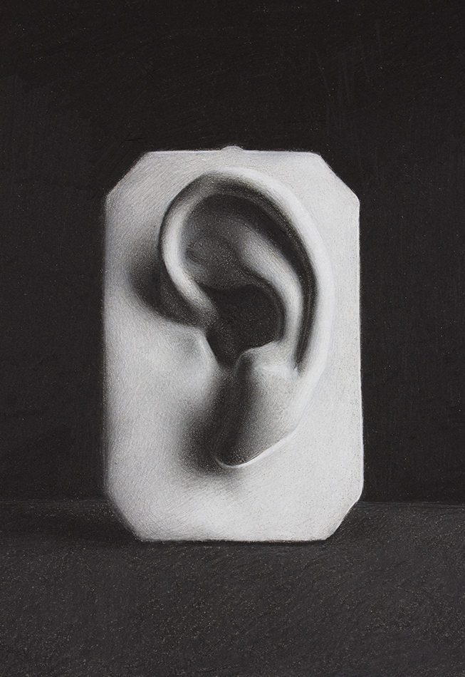
Darkest Dark Values
Lightest Light Values
My next goal is to establish the 'darkest dark' values and the 'lightest light' values in the scene. I'm looking for my two value extremes in the image. Squint at the photo reference (downloadable at the bottom of this page) and ask yourself:
Where are the absolute darkest values in the scene? Earlier, we broke down the image into light, midtone and dark. Within those dark values will be certain accents that are the darkest in the scene, and areas that are slightly lighter but still fall into the 'dark values' category.
Where are the absolute lightest values in the scene?
This step is not exclusive to black and white charcoal drawing! It is an essential step to all successful value drawing.
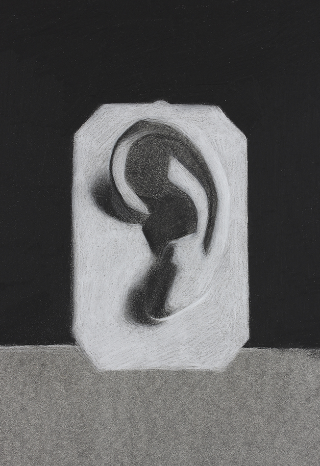
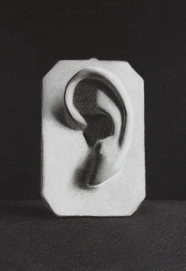
Here I have established the 'darkest dark' values and 'lightest light' values that were indicated in the diagrams above. We always want to establish these value extremes early on in the drawing, so that we have those two variables to compare the rest of our values to.
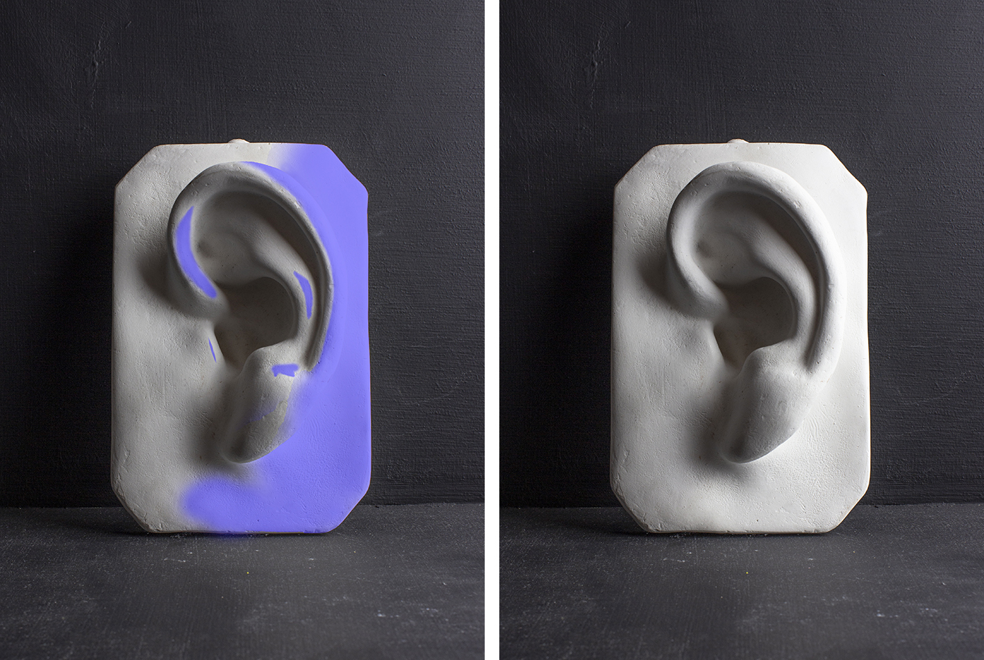
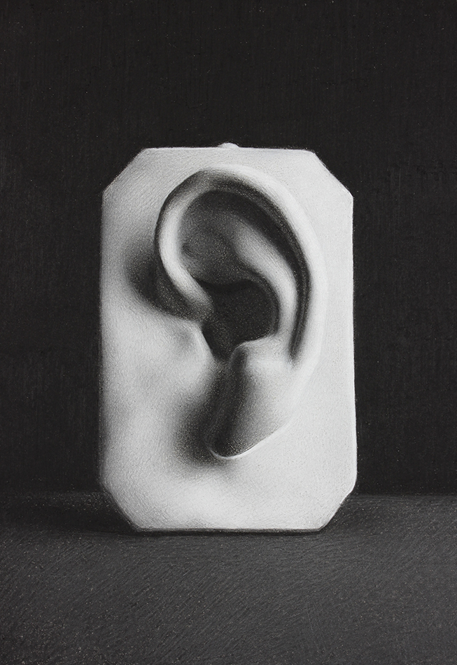
Only now that I have established the value extremes in the scene do I start drawing the half-tone values.
I begin drawing in half-tones where the softest edges are in the scene - areas with slow gradations, such as the earlobe, and the top left portion of the plaque, where the shadow cast by the ear slowly turns into a middle value.
As we saw in the Half-Tones Diagram earlier in this article, the entire left side of the plaque falls into the 'middle value family'. This is especially evident when we squint and compare the left side of the plaque to the right side. Here I am continuing to tone down the left side of the plaque, while beginning to model some of the smaller indentations and protrusions through subtle shifts in value.
I am starting to develop the forms within the shadow area inside the ear. These need to remain dark enough to read as being 'dark', not 'half-tone' (if I squint, they should still merge together into one dark mass).
Smoothing and Finishing
the Black and White Charcoal Drawing
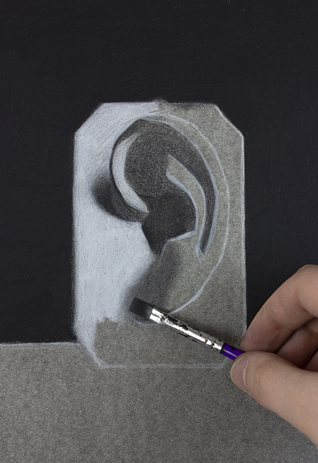
At this point I am smoothing and refining my black and white charcoal drawing. I smooth out the inconsistencies in value by filling in the value gaps left between pencil marks.
The last element that I will work on is the surface on which the ear cast rests. Currently it has little variation, and is not yet finished to the same degree as the ear. It doesn't need to be as detailed or nuanced as the ear because I don't need or want to attract the eye to this bottom third of the drawing. However, in order for it to not look out of place, I will smooth out areas by filling in the tiny gaps in value between the pencil marks, and add some slight variety to the surface.
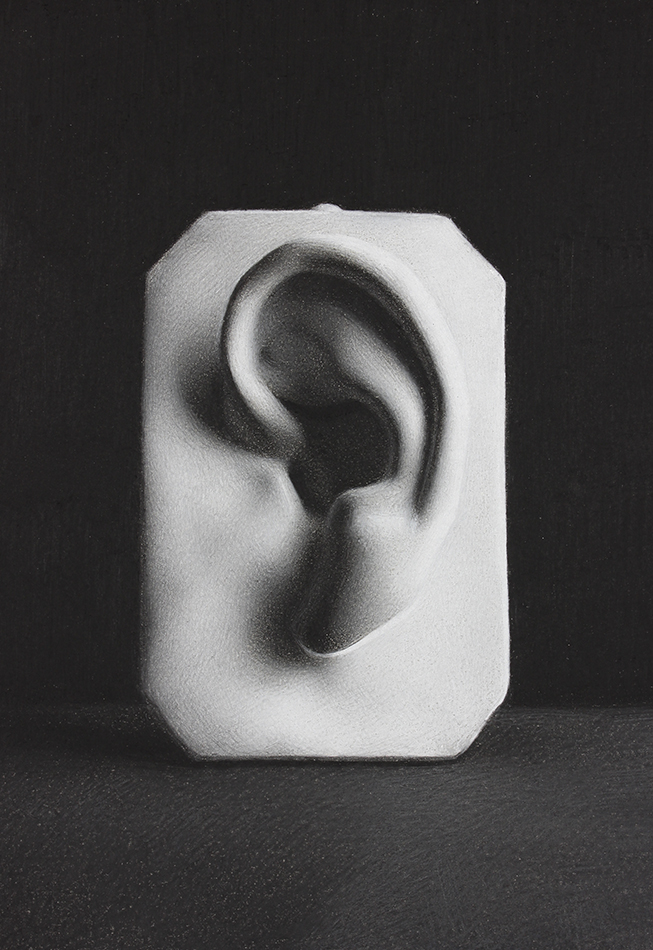
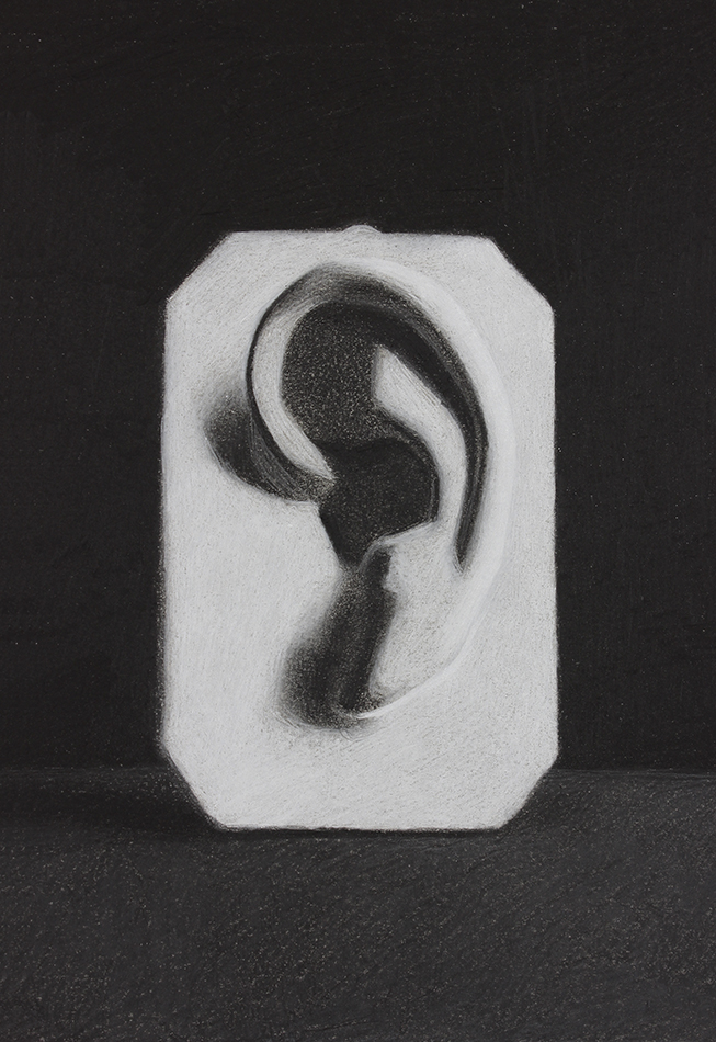
I have added some slight variations to the background to conclude my drawing!
I hope you try this blended black and white charcoal drawing technique! You can download the reference photo of the ear cast I have been drawing from below, and start experimenting with the technique that way. Or, start with a simpler subject matter - a sphere, for example!
(There is also a downloadable infographic of this step by step tutorial available in the Free Members-Only Drawing Resource Library! Enter your email below if you're not a member yet!)
Give it a try and let me know what you think. If you have any questions pertaining to this blended black and white charcoal drawing technique, please comment below, or email me at marina@thedrawingsource.com
Happy Drawing!
F R E E D O W N L O A D
Learn to use this black and white charcoal drawing technique by downloading ...
- A reference photo of the ear cast I'm drawing from
- An infographic of this step by step tutorial
- Plus, access the free Members-Only Drawing Resource Library!
Enjoyed this page? Please share it!
Share buttons and pinnable image below:
If you enjoyed this page on blended black and white charcoal drawing, you may also enjoy ...
Related Pages
How to Draw an Ear on Toned Paper
How to Draw Glass Using White Charcoal on Black Paper
3 Ways to Use White Drawing Pencils on Toned Paper
Value Drawing: The Key to Realism
Return to Drawing Tutorials from How to Create a Blended Black and White Charcoal Drawing
Return to the Homepage from How to Create a Blended Black and White Charcoal Drawing
Search the site above


